
This is part three of a three-part introductory series to color grading by Chris Packman, Head of Grading at The National Film and Television School. This series of articles is intended for those at the beginning of their color grading training.
You should review Color Grading 101 and Color Grading 102 before moving on to this lesson.
Remember, grading is like building houses. First you dig the foundations, then put up the walls, then the roof trusses and then put the roof on. Get it wrong and it all falls on your head!
- Once you have the overall levels correct and the overall color balance then, we can consider secondary color correction.
- Secondary color correction acts on just one color or selection of colors.
- It is quite normal to qualify the selected colors using a shape.
Hue Curves
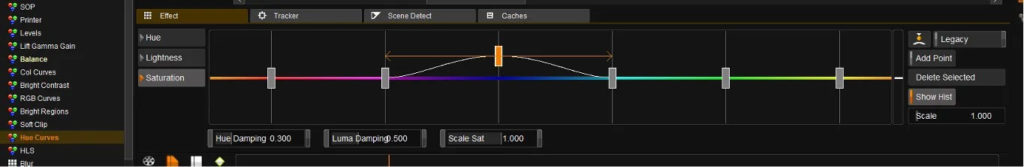
- The Hue Curves are a wonderful way to make general secondary changes to the image.
- They are particularly useful for toning down trees and grass and for changing Summer into Autumn.
- Using them in a wide range makes gentle creative corrections easy.
- They can be qualified with a shape if required.
Load the timeline from Color Grading 102.
Find a shot with some intense colors and adjust the sliders to change the colors.
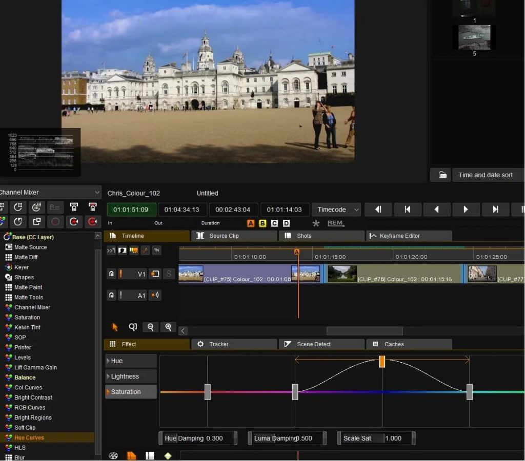
Here we can see that I have pushed (increased) the saturation of the blue sky. Something that is often requested!
As you will find the Hue Curves are easy to use and deliver impressive results very quickly without being fiddly.
For more selective secondary color correction keying is the best route to use.
The Keyer
Find a shot with a strongly colored object in the timeline.
Get the basic grade correct.
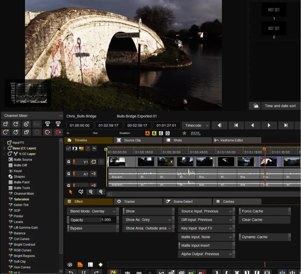
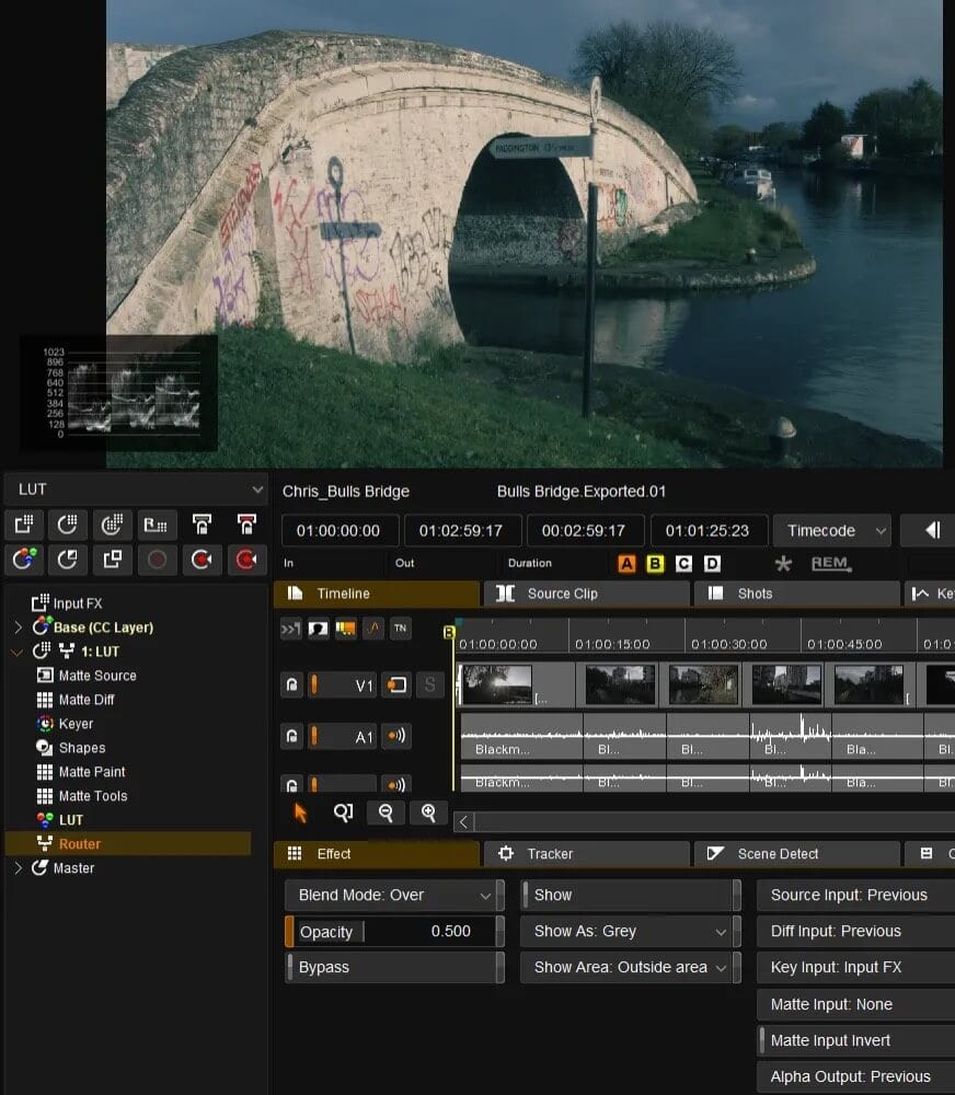
Add a Color Correction layer (adding a layer before doing anything complicated is good practice as it allows easy comparisons to be made and can easily be undone if required).
Select the Keyer
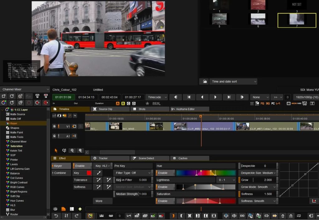
Use the little eye dropper to select the color on the viewer screen that you would like to affect.
Adjust the HLS sliders to get a good key.
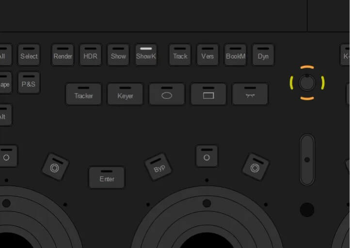
If you are using a Tangent panel, you can map the Show K button to one of the buttons and see the key.
If you have no panel run the Precision Panel Emulator software that came with Nucoda and select Show K from there to see your key.
Use the Grow and Softness controls to improve the edges around your key.
Once you have your key you can now adjust any of the primary controls on that layer to affect the keyed area.
You can see in my example that I need to add a shape to stop increasing the saturation on the sign above the bus.
Select Shapes
Select Rectangle and draw it around the area to be adjusted.
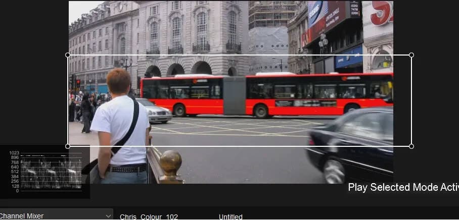
Now the sign is not affected by the extra saturation added to the bus.
Looks
It is often requested of the colorist to give part of or all of a program a “look”. Here is how to do two of the most famous.
Bleach Bypass or Skip Bleach is one of the oldest grading looks and deserves to be in every colorist’s toolkit. The look simulates a chemical process whereby during development of the film the bleach fix bath was bypassed or skipped. This leads to extra retention of the silver giving deep blacks and a crunchy texture, there was often also some white crushing and slight desaturation. Obviously doing it this way fixed the look into the film. It was normally done at the print stage, but some developed the negative this way! With the move to digital grading, we are now able to emulate this look without burning it into our source material and creating a look that can be backed off if required.
Load the timeline from Color Grading 101
Find a shot to be Bleach Bypassed
Give it a basic grade
Add a Color Correction layer
Reduce the Saturation to 0
Go to the Router at the bottom of the list of actions.
Select Overlay
You should now have a Bleach Bypassed shot. Use the Opacity on the Router to control the strength of the affect.
You may need a little overall desaturation in the Base layer to get a good look.
You can add a little film grain (DVO Regrain RGB) to finish off the look.
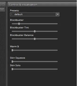
The Blockbuster Look
The “in” look of the moment is the Blockbuster (Orange and Teal) look.
Here are two straightforward ways to do this look
As we saw in Color Grading 101 Grossgrade is a great Windows LUT convertor.
Within it is a Blockbuster module.
Load the BMCC to Rec709 V2.cube LUT file into Grossgrade.
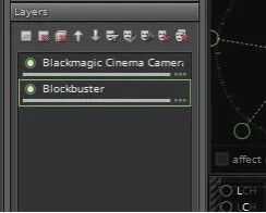
Add a layer and add the Blockbuster module.
Set the Blockbuster level to about 25%
You now have a LUT that will do the BMD Film to 709 conversion and add the Blockbuster look.
Export it as .cms file and add it to your Nucoda LUT directory.
Method 1
Add the LUT as normal in the setup menu. The LUT will be applied to all shots.
Advantages, easy. Disadvantage, difficult to change the level of the look if too strong / weak.
Method 2
Add the BMCC to Rec709 LUT as normal in the setup menu. This will take care of the camera part of the correction.
Add the Blockbuster LUT on a shot-by-shot basis using an FX layer.
Use the opacity control in the Router for the FX layer to control the level of the effect.
Save the effect to a memory and add to more shots as required.
Trim the level of the effect on a shot-by-shot basis to get a good even feel.
Appendix
An updated version of Grossgrade was issued in early September 2020. With this version it is necessary to load the Blockbuster module as it no longer appears automatically in the menus.
Go to load module.
Look in the modules directory under experimental and you should find Blockbuster.ggm.
Load and use the module.
