
Here at Filmworkz we’re crazy about color in film, endlessly fascinated by the creative ways filmmakers can manipulate it to tell a story. Since the inception of Digital Intermediate, color grading has become an art form in of itself, often closely working with the cinematographer, to achieve stunning visuals and emotionally charged scenes. We rounded up our top 10 favourite color graded films to get you started…
Mad Max: Fury Road (2015)
Eric Whipp, who was the color grader, said he revelled in a brief that essentially said this film ‘should be saturated and graphic, and the night scenes should be blue’. In order to separate itself from other apocalyptic movies that were bleached and de-saturated, Mad Max: Fury Road wanted to make itself visually distinctive by engaging with these opposing aesthetics, especially when considering that much of the film takes place in the desert which has a limited block palette. Whipp increased the sharpness so as to induce a grit and a rawness to the scenes, and said that every time he worked on a shot, he would try to ‘make it look like a graphic novel’.
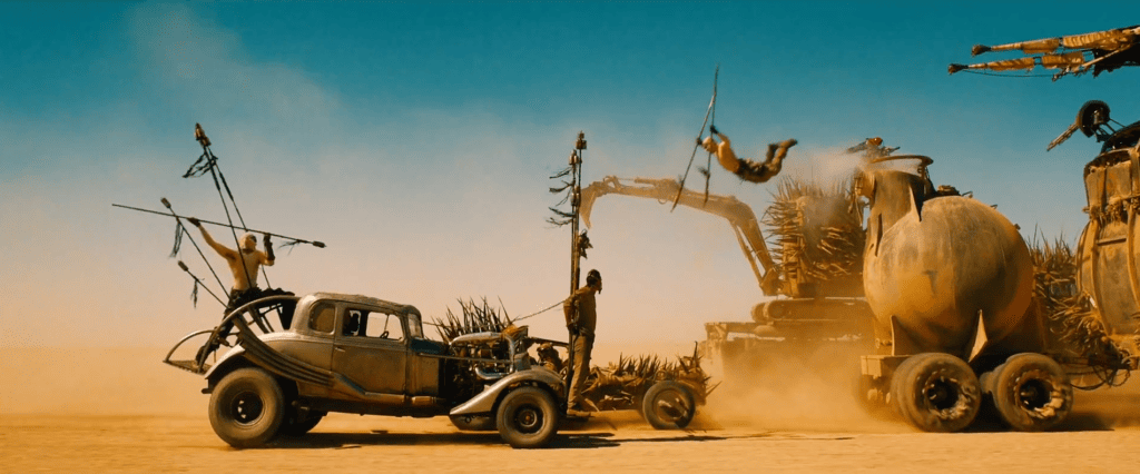
Director George Miller believed in the ‘eye-scan’ philosophy where an audience should not have to actively search what’s going on in the image. As such, each shot was framed so you knew where to look, and grading worked well here as techniques like vignettes or shading would help draw your eye in and make sequences smoother. This applied to the actors’ eyes too: since there is such little dialogue, a lot of the performance comes from the looks and expressions. Whipp rotoscoped every eye in the fall to add contrast and sharpness, adding a vividness that becomes unavoidable.
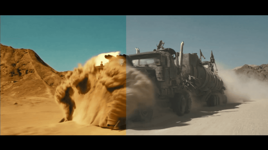
Creating the right tones for the night sequences took some experimenting as well – between the team, they decided to shoot two stops over-exposed on the day shoot, which would allow Whipp to expose the shot back down in the color suite whilst implementing the grade for the blue-toned night shots as well as bring forward any detail in the shadows with little to no noise.
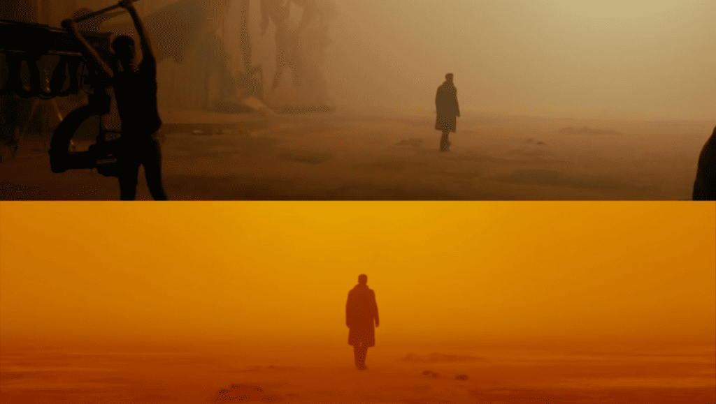
Blade Runner 2049 (2017)
This visually rich and intensely dense film is an obvious contender, thanks to its color rich palette spanning from neon lights to orange smog. The sand-storm struck Las Vegas, which creates the famous orange fog scene, is almost pungent in its saturation and this suspension of imagery gives way to some great stills. Cinematographer Roger Deakins emphasised camera angles to align with the architecture so the characters are always framed, and used dietetic lighting to create a sense of dynamism.
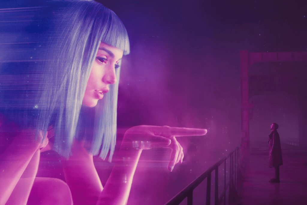
“We shot the ‘Pink Joi’ element first. When we shot the scene with Ryan, I felt it important that we play the element at a true scale so that the lighting could be interactive between the advert and K. There’s rain and fog in the scene, so we filled the stage with mist and had this 40-by-30-foot LED screen playing back the image that we had shot during pre-production. The pink-and-blue advert was basically lighting the whole shot — the atmosphere and Ryan. The light changes as the advert changes.”
Critics were also quick to pick up the significance of color in certain moments: yellow symbolised a source of information and enlightenment appearing whenever there was a major plot twist, green became associated with K’s robot girlfriend Joi playing on the irony of growth and life that is denied in her lifeless form, and pink and purple represented sensuality and love interests.
Fantastic Mr Fox (2009)
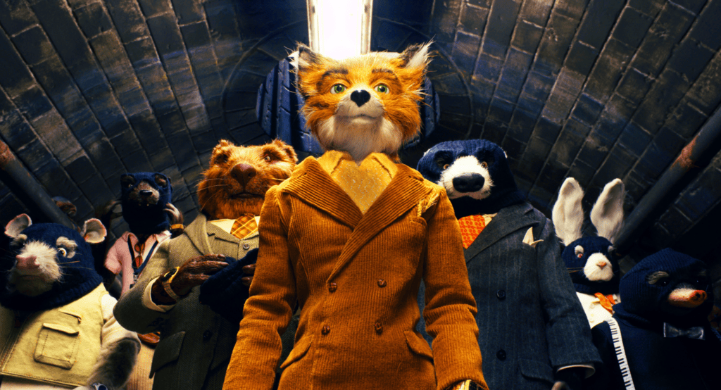
Whilst perhaps all of Wes Anderson’s films could be categorised within this article thanks to their charming color palettes, Fantastic Mr Fox especially leans into Anderson’s famously whimsical aesthetic. Overwhelmingly saturated in yellows, browns and oranges, from foxes to cider, this palette consistently returns to the central eponymous characters. Anderson rarely ventures into cooler tones, and yet subtle shifts in this unassumingly limited palette are still able to create feelings of suspense and isolation.
Vertigo (1958)
Filmed in the golden age of technicolor, color was bold, bright, and saturated. Hitchcock was one of the first for pioneering color symbolism in film – for many, when you say Vertigo, you think green. Perhaps its more specifically is linked to Madeline and her romantic perception of San Francisco – from her car, to the florists, to the lawn of the Palace of the Legion of Honour, and to one of the most famous scenes where Scottie opens the red door to her apartment where she is sitting, bathed in the green porch light.
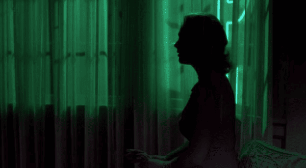
This symbolism plays across for other moments; red for caution or danger, like the aforementioned door or Midge’s dress when tries to stop Scottie’s romantic disillusions, blue for scottie’s guilt like at the death of a fellow officer, Midge is associated with yellow like her sunny personality. This is all in conflict when Scottie dreams, inviting us into his psychological confusion.
O Brother, Where Art Thou (2000)
Although some movies before this were beginning to experiment and use digital intermediate in certain shots, O Brother, Where Art Thou was actually the first film to be entirely color graded digitally. Whilst many filmmakers and film lovers are still big fans of shooting on film for its more textured and artistic qualities, color grading on film can be fiddly as you’d have to adjust the reds, greens, and blues through a printing process.
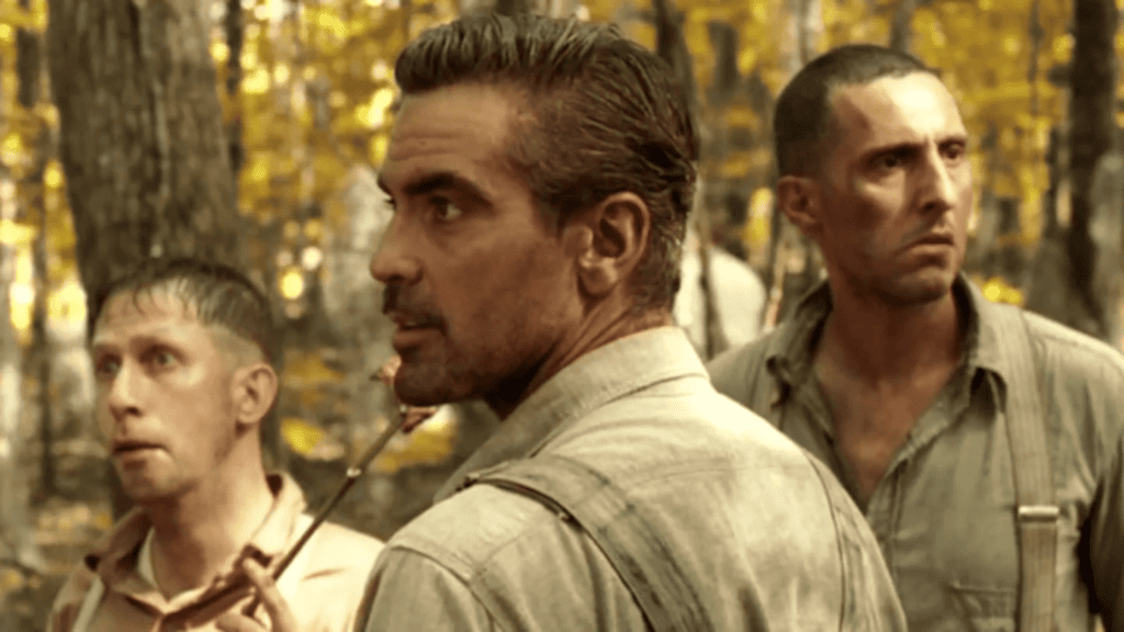
The Coen brothers had decided to introduce a sepia tone throughout the film to evoke the Great Depression era. They did start by using color correcting on film but ‘it ended up being like six different chemical processes, and we never got anywhere close’. Shot in Massachusetts, where it was ‘greener than Ireland’, using DI allowed them to reconstruct their yellow-burnt wasteland in a way they couldn’t have done to the same extent before. Suddenly, using DI was standard practice and regenerated a whole industry for color grading which paved the way for tech like Phoenix.
2001: A Space Odyssey (1968)
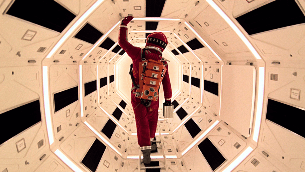
Filmed before the creation of DI, 2001: A Space Odyssey relied on the good old fashioned techniques of the Hazeltine Collar Analyzer, which essentially was a calibrated color monitor that was connected to a scanner displaying a positive image from the negative, and adjustments would be made manually on there.
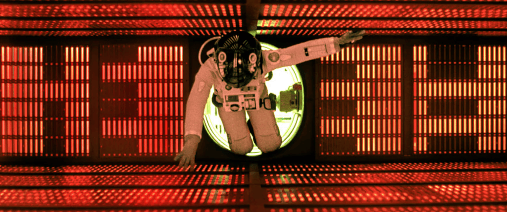
Often commended for its likeness to realism, the sharp cutting shots of the illuminated space station set against the deep black of outer space is incredibly visibly sterile. And yet, not in a way that lacks any feeling – this sterility encompassed by a stripped back but deeply contrasting color palette feels unsettling, unnerving, uncomfortable. Not a word is said until 25 minutes in, so the visuals are entirely foregrounded and the suspense begins to feel unbearable. Then, in moments of great significance, the screen bursts into color. It was recently restored to 4K using Phoenix by Blake Jones, introducing a new generation of sci-fi lovers to see each saturated color as Stanley Kubrick intended.
Harry Potter and the Order of the Phoenix (2007)
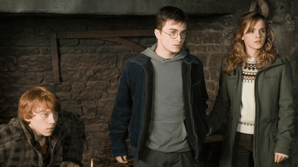
With the first few films generally using warmer tones and bright hues to convey the marvel and wonder of magic and Hogwarts, the overall grade gets a lot darker, bluer, and murkier as the saga progresses, reflecting the ominous and bleak prospect of Voldemort’s reign. Met with some unhappiness from fans who say they struggle to see detail in such dark shots, Order of the Phoenix is perhaps the first film in the second half of the series that does signify an overall darkening.
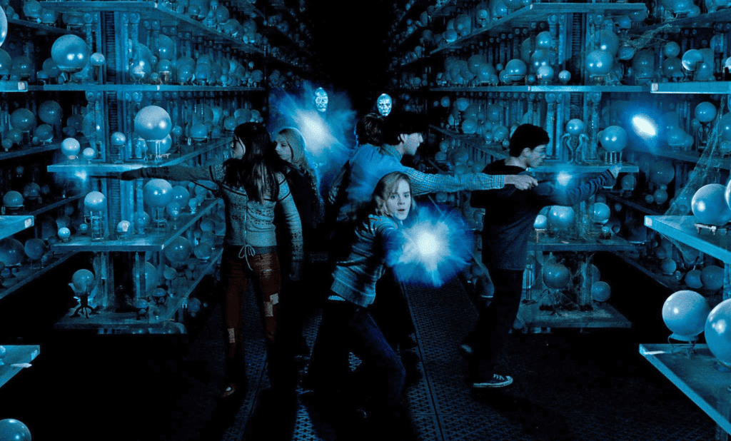
From Harry’s isolation at the hearing, mourning the death of Cedric Diggory, the sense of hopelessness in the wake of Dolores Umbridge, this film is a culmination of consequences of a looming war. Color grading extraordinaire Peter Doyle spoke with Filmtalkz last year about his work on the Harry Potter series and The Lord of the Rings. Due to the sheer scale of these films, Doyle established a ‘pop up’ DI facility for Warner Brothers for Harry Potter so that they could grade as they filmed.
In the Mood for Love (2000)
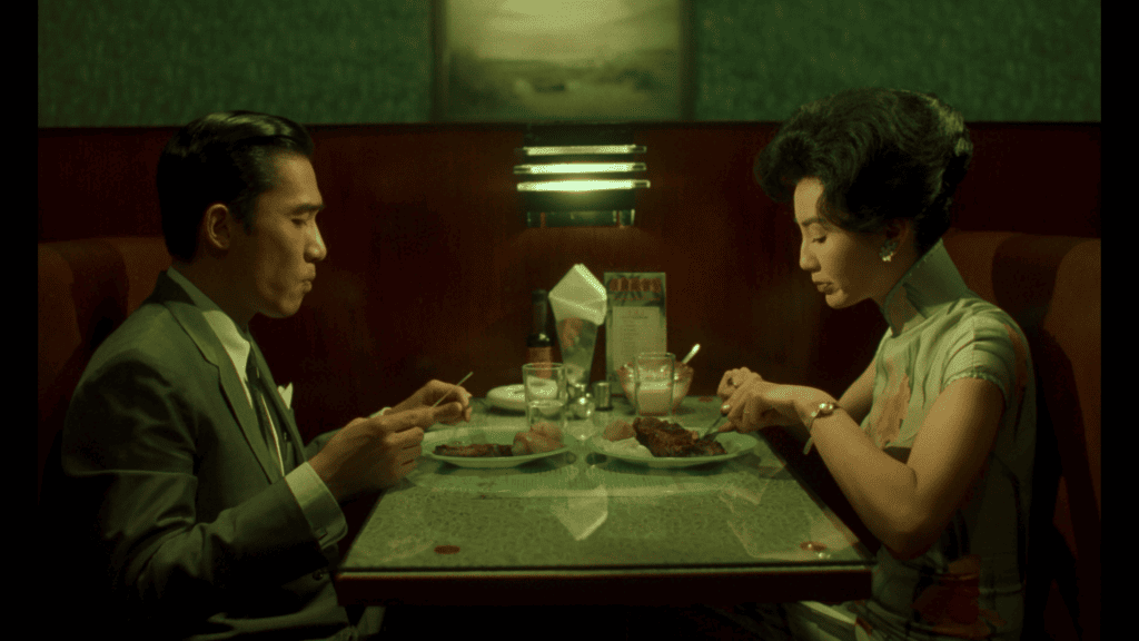
In a film of few words, what you see is what you get, and what you get is stunning. Cinematographer Christopher Doyle, alongside director Wong Kar-wai, used a rich palette where deep crimson and lush emerald hues intertwine, symbolizing repressed passion and unspoken desires. The attention to period-specific color schemes immerses viewers in the evocative 1960s Hong Kong setting, where subtle gradients and tonal shifts express everything the characters aren’t saying, and mirrors the narrative’s themes of longing and unattainable connection. Doyle’s lens captures not just a story, but an immersive experience where colors are characters in their own right.
Twilight (2008)
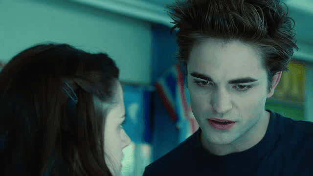
Perhaps an odd choice to add to this collection, but the overwhelming blue hue of the first Twilight film is so distinct that it made it a cinematic icon, if not a pop culture one. Although the later movies were filmed as blockbuster chick-flicks, the first one went in with the intention of maintaining an artistic flair.
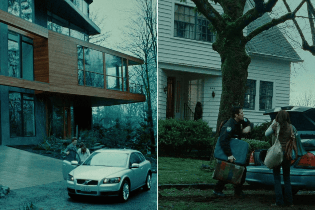
This melodramatic blue tint perfectly leans into the murky and sinister world of vampires, playing on teenage tropes of isolation and angst. Director Catherine Hardwicke first experimented with these blue tones in her debut film Thirteen (2003) (that also starred Nikki Reed), but then this palette was left behind when the series was taken over by a different director.
Avatar (2009)
Although the second film in this franchise was met with criticism online for being too blue (blue people in blue water? James Cameron – make it make sense!), when the original debuted the world was taken aback with the crystal clear colors of the world of Pandora. What was revolutionary about Avatar was that almost 70% of the film is done on a computer with Cameron famously spending 15 years waiting for the technology to catch up with his vision.
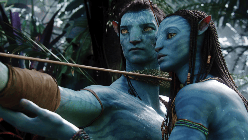
Immersed in a different planet, the tropical jungles contrasting with the brutalist human colonies created brilliant contrast, and color was so integral to be immersed in this dazzling alien world. The use of light, color and CGI was also spectacular in the scenes under the bioluminescent trees, harmonising soft glows and whimsical hues of an otherworldly ecosystem, and even meant it won the Academy Award for cinematography.
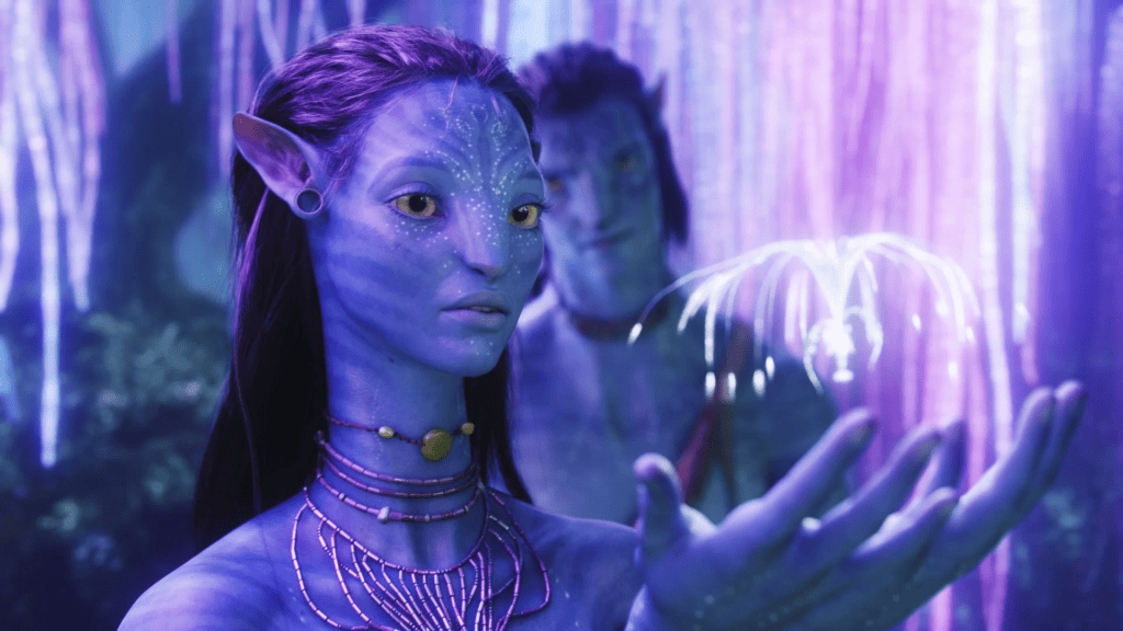
Cinematographer Mauro Fiore felt that light allowed the scenes to blend into a coherent movie, and even used reflective paint and materials to react with the UV that differentiated them in post production and made the green screen feel invisible. In order to hide the strong beams of the lights in the studio, Fiore cut green strips to hide the lights like curtains. The team would even shoot an exterior day scene at night sometimes so that they could control the lamination entirely.
